The Significance of Mobile-Optimized Websites for Dental Practices in Toronto
With digital engagement now a cornerstone of patient communication, dental practices across Toronto and the Greater Toronto Area (GTA) must view their websites as more than just digital placeholders. Scheduling appointments, reading service reviews, and comparing local clinics—all of these are happening on mobile phones. Yet, many dental professionals overlook a critical component of digital success: ensuring their websites are optimized for mobile use.

Shifting Patient Expectations and Digital-first Behaviour
Modern dental patients aren’t just comparing treatment plans—they’re evaluating the experience from the first click. A seamless digital presence that starts with a mobile-optimized website signals professionalism, accessibility, and trust. Whether it's a new patient searching Google Reviews or a returning one trying to rebook via their phone, your website needs to meet these digital expectations. In the hyper-connected healthcare landscape of the GTA, this has shifted from being a nice-to-have to a strategic necessity.
The Dominance of Mobile Usage in Toronto's Healthcare Market
In Canada, over 80% of users access the internet via smartphones, and in urban areas like Toronto, these figures are even higher for health-related searches. Patients on the go—commuting on the TTC, waiting for school pick-up, or during work breaks—are comparing dental services and looking for appointment availability using their phones.
This shift means dental practices that rely on outdated or desktop-only websites may be inadvertently turning away prospective patients. Investing in a responsive, mobile-first design is a proactive solution to this behavioural change—and it aligns perfectly with digital policies emphasized by Canadian healthcare communication standards.

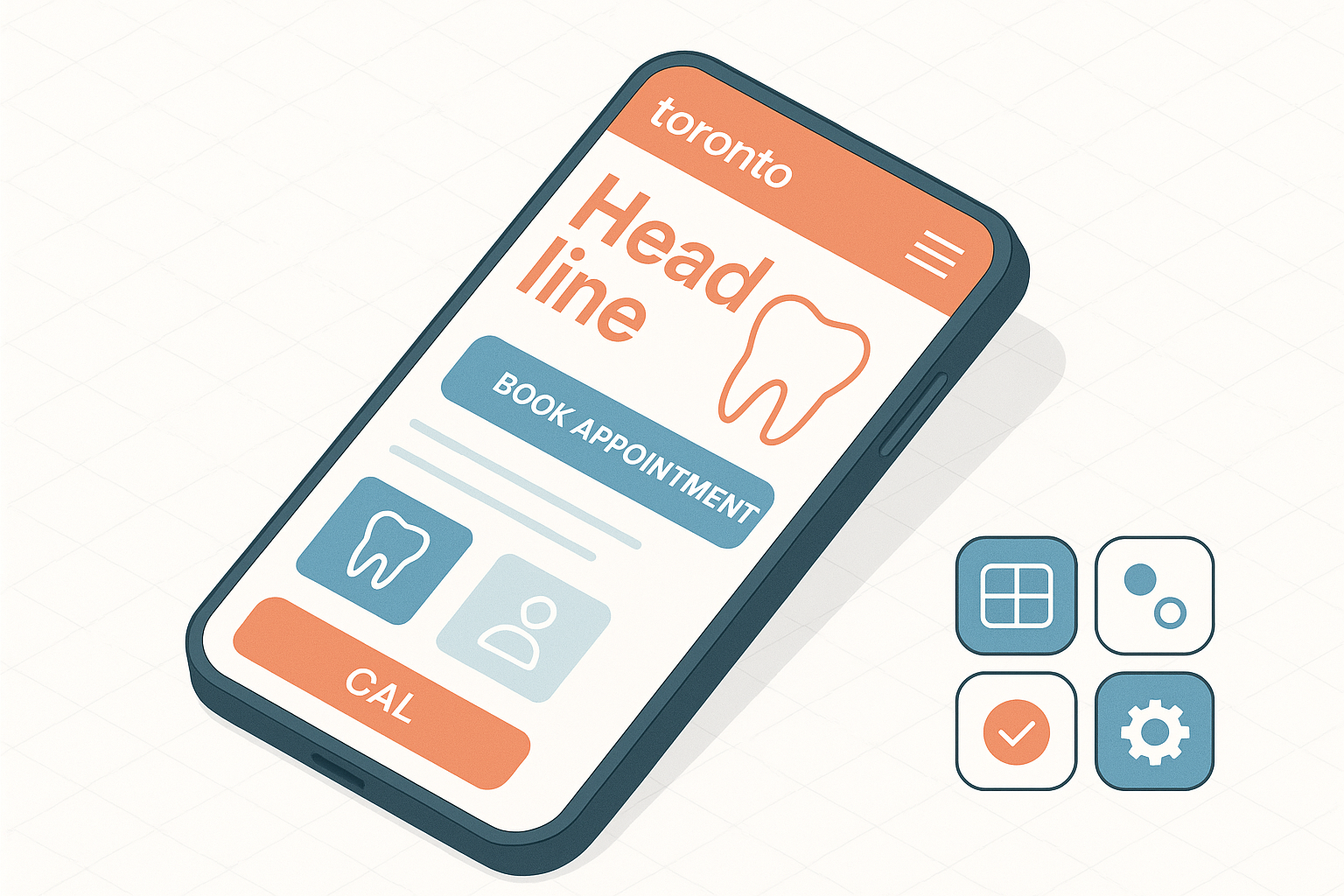
What Does a Mobile-Friendly Dental Website Include?
Mobile-optimized doesn't just mean your site “loads” on a phone. It means adaptive structure, fast response, and intuitive design. The visitor should never have to resize, scroll excessively, or wait for pages to load. These are the factors that define user intent and dictate Google search rankings.
- Responsive Design: Automatically resizes elements for optimal viewing across phones, tablets, and desktops.
- Speed Optimization: Pages must load under 3 seconds to avoid bounce rates and keep users engaged—an especially critical factor per EBIKO's imaging systems that depend on large data files and online navigation.
- Clear Navigation Menus: Simplified menus/megamenu for scheduling, services, and contact info enable fast access without multi-click frustration.
- Readable Typography: No squinting or pinching—the font size and text hierarchy should follow WCAG accessibility guidelines often emphasized by Ontario’s Accessibility for Ontarians with Disabilities Act (AODA).
- Optimized Calls to Action (CTAs): Book-now buttons, service pages, and contact links must be placed prominently above the fold for quick conversions.
- SEO Metadata: Includes mobile-specific schema, image alt texts, and faster site indexing from mobile bots used by Google.

How Mobile Optimization Supports Growth and Gains Competitive Advantage
From clinic visibility to patient engagement, every aspect of practice growth touches the website. A mobile-optimized platform strengthens four main pillars:
- New Patient Acquisition: Higher search visibility and smoother browsing lead to increased conversions, especially from busy professionals or parents looking for convenient care nearby.
- Improved Patient Retention: Returning patients appreciate quick rebooking functions, service transparency, and accessible post-operative details—features that must shine effortlessly on mobile devices.
- Digital Trust and Branding: A clean interface gives your practice authority, aligning with your reputation in the local GTA community.
- Compliance Assurance: Smartly integrated features such as secure digital forms with protective barrier protocols ensure HIPAA compliance and reassure patients about their data safety.
Integrating Modern Tools from EBIKO for Better Digital Dentistry
EBIKO Dental offers advanced solutions that can help support modern digital features on your website. Clinics utilizing diagnostic tools like the Scan-X Phosphor Plate System or patient management tools such as X-ray Sensor Holders can integrate patient education modules into their website. This elevates not just your online appearance but also deepens patient trust in your technologies and capabilities.

Best Practice Guidelines for Dental Websites in Canada
Dentists operating in Ontario must also consider AODA compliance when designing accessible websites. This includes readable fonts, alternative text for images, mobile-friendly navigation, and proper colour contrast. Additionally, consider:
- Implementing HTTPS security certificates
- Including mobile tap-to-call functionality
- Ensuring diagnostic tools advertised (such as the Sopro 717 Intraoral Camera) are linked logically
- Embedding Google Maps for mobile wayfinding services
Conclusion: Make Mobile Optimization a Strategic Priority
Dental practices in the Toronto area must embrace mobile website optimization not just for aesthetic or technical reasons—but to actively enhance the patient experience and build sustainable growth. If your website feels outdated, takes too long to load, or hides vital information behind unclear menus, you're likely losing patients every day.
Consider leveraging modern tools and technology solutions available from EBIKO Dental as part of your future-focused strategy. From imaging systems to sterilization tools, their product integration potential can also boost the content you display online—creating a seamless user journey from website visit to in-chair consultation.