Responsive Dental Websites: Best Practices for Dentist Success
The digital presence of your dental practice has a direct impact on patient acquisition and retention—particularly for clinics in highly competitive urban areas such as Toronto and the GTA. In today’s mobile-first world, having a dental website that is responsive and easy to navigate on any device isn’t just a nice-to-have; it’s a necessity. This guide explores how a mobile-responsive website can shape your dental clinic’s success and outlines actionable steps to stay ahead.

Understanding the Preference for Mobile Devices in Dentistry
Most dental patients begin their journey online, often through a quick mobile search for dental clinics near them. Whether they’re looking for emergency care, dental cleanings, implants, or cosmetic procedures, they expect fast-loading, readable, and easy-to-navigate websites—right from their smartphones or tablets. This shift in behaviour means that Toronto dentists must prioritize responsive design to avoid losing patients to other clinics with more user-friendly digital interfaces.

Why Mobile Usability is Essential
More than 60% of website traffic in Canada now comes from mobile devices. For dental professionals, this means your new patients are more likely to view your services, book appointments, or read reviews on their phones. Websites that are not optimized for mobile tend to load slower, are harder to navigate, and often suffer from poor search engine performance. Ensuring your site is responsive boosts engagement and organic traffic — making it one of the smartest marketing moves you can make.

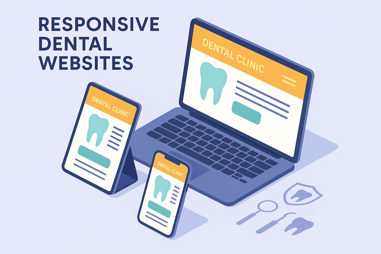
What is a Mobile Responsive Website?
A responsive website dynamically adjusts its layout to suit different screen sizes—smartphones, tablets, laptops, or desktops. For example, buttons get larger and easier to tap on mobile, text resizes for readability, and navigation menus condense to ensure clarity. This flexibility results in a consistent and effective patient experience regardless of how they access your site.

The Benefits of Having a Responsive Dental Website
- Enhanced User Experience: Mobile-friendly layouts make it easier for patients to navigate your website, view services, and book consultations without frustration or confusion.
- Improved SEO Performance: Google’s algorithms prioritize mobile-ready websites. A responsive website helps boost visibility in Toronto’s competitive local search rankings.
- Better Conversion Rates: Websites that function well on mobile devices usually offer quicker pathways to appointment booking, resulting in improved patient lead generation.
- Lower Maintenance Costs: Maintaining a single responsive site is more cost-efficient than managing separate desktop and mobile websites.
- Technology Adaptability: Responsive websites can automatically accommodate new screen resolutions and devices, preparing your practice for future digital developments.


Testing Your Dental Website’s Mobile Responsiveness
Ensuring your clinic’s website works on mobile is simpler than you think. Here are some basic steps you can use right now:
- Open your site in a desktop browser like Google Chrome or Safari.
- Resize the browser window slowly to replicate various screen sizes. If the content reorganizes itself to fit the new size while remaining readable—that’s responsiveness.
- Try accessing your website on a real smartphone. Can you find your clinic’s contact info, services, and appointment forms quickly?
- Use Google’s Mobile-Friendly Test tool to analyze your site and pinpoint improvement areas.

What if Your Dental Website Isn’t Mobile Responsive?
If your site performs poorly on mobile devices, it might deter potential patients and degrade your SEO rankings. But there’s no need to panic. The most effective solution is to partner with a trusted GTA dental supplier with experience in digital solutions. Updating your site to meet modern standards should be part of your broader strategy to boost online presence and build trust with new and existing patients.

Get Started with EBIKO Dental Solutions
At EBIKO Dental, we don’t just provide dental supplies across Canada—we’re dedicated to helping dental professionals enhance every part of their practice. This includes digital transformation tools such as responsive web design, content optimization, patient targeting strategies, and technical support tailored specifically for the Canadian dental industry.
Whether you’re launching your first clinic or upgrading a legacy website to meet today’s standards, our digital solutions team is ready to bring your dental website up to speed with cutting-edge responsiveness and patient-friendly layouts.
Schedule a complimentary consultation and future-proof your dental clinic’s digital platform for today’s mobile-dependent patients.